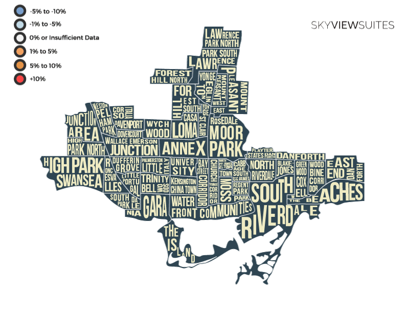
Toronto Neighbourhood Price Change Map 2018
The Ups & Downs of Toronto's Condo & Housing Prices
Riley Densmore - Data Marketing Analyst
July 12th 2018, TORONTO
The Toronto housing market has been on a price rollercoaster over these past 12 months and everyone is curious to see how prices will trend going forward.
Recently we’ve seen housing prices cool down, but as condo experts, we were interested to see if this had any effect on the condo market.
Over the past few weeks, we’ve carefully been collecting data on both the housing and condo market to see what the experience has been in the past year.
A few years ago we (Sky View Suites - furnished rentals & condo experts) released the Toronto Price Map that illustrated the lowest and highest prices based on Toronto neighbourhoods. Now we’re back with an all new recreation of the map that highlights the positive and negative changes in prices for houses and condos comparing Q1 of 2018 and Q1 of 2017.
The Data:
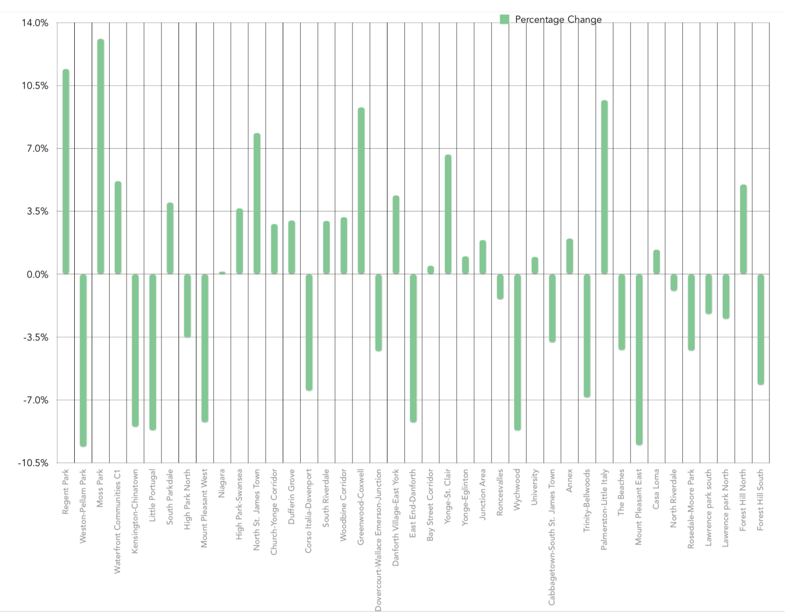
- From the first quarter of 2017 to the end of the first quarter of 2018
- Pulled from multiple data sources.
- Average prices were recorded for each neighbourhood district.
- Any outliers were removed to create a meaningful data set.
- Neighbourhoods that had less than 30 data points were remitted
The Results:
- Area's that are experiencing (or experienced) condo development saw and increase in average price.
- Many homes previously listed in the upper first millions of dollars, saw a decrease in average price and sales volume.
- Most interesting or notable change in the data were neighbourhoods such as Moss Park and Regent Park which had price hikes since Q1 of 2017.
As for where the housing market is heading next, it seems unpredictable so far. On the other hand, as the housing market seems to cool down, the condo market is still very active in the downtown core. As inventory demand increases in the downtown area, we can expect prices to heat up in condos.